

What it is: Marcelle Wet and Dry eyeshadow quads in Royalty and Teal Chic, the shadow offerings from Marcelle’s Fall/Winter 2010 collection, Brighten Your Eyes.

A bit about Marcelle quads: The cool thing about Marcelle’s Wet and Dry quads is that they’re made to use wet and dry — which means that if you use them to foil, they dry right back to “normal.” No hard layer or discolouration! In total, you get 6g of shadow (0.05oz per shade) and they’ll run you $14.25 regular price.
Ingredients:
TALC, SYNTHETIC FLUORPHLOGOPITE, ZINC STEARATE, ALUMINA, ETHYLHEXYL PALMITATE, DIMETHICONE PEG-7 ISOSTEARATE , BORON NITRIDE, CALCIUM SODIUM BOROSILICATE, METHICONE, SILICA, POLYMETHYL METHACRYLATE, IMIDAZOLIDINYL UREA, METHYLPARABEN, PROPYLPARABEN, TIN OXIDE, TOCOPHERYL ACETATE,
May contain: MICA, IRON OXIDES, TITANIUM DIOXIDE , ULTRAMARINES, CHROMIUM OXIDE GREENS, ALUMINUM POWDER, BRONZE POWDER, FERRIC AMMONIUM FERROCYANIDE, FERRIC FERROCYANIDE, BISMUTH OXYCHLORIDE, MANGANESE VIOLET, CHROMIUM HYDROXIDE GREEN, CARMINE, BLUE 1 LAKE


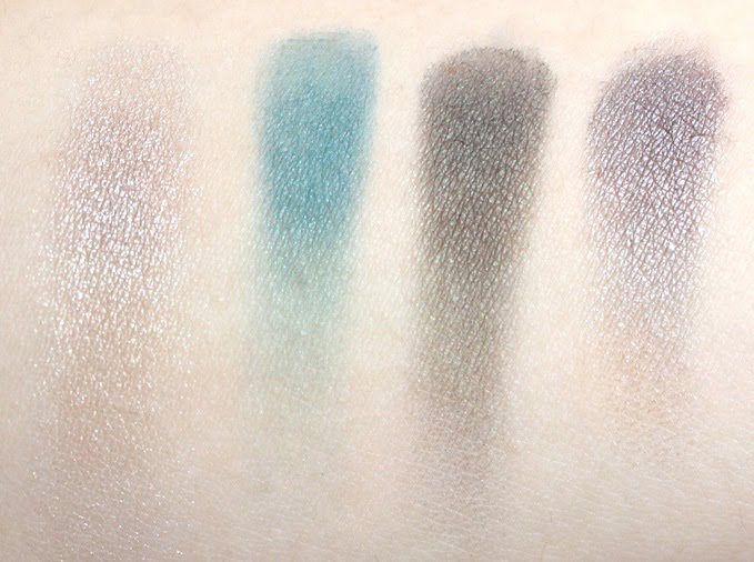
See that bottom right hand shade, the indigo-violet one? Well, it’s the violet I’ve spent months looking for — the perfect, not-to-blue, no-red kind of violet. I absolutely adore it. A ridiculous amount. I would literally buy the entire quad just for that one shade.
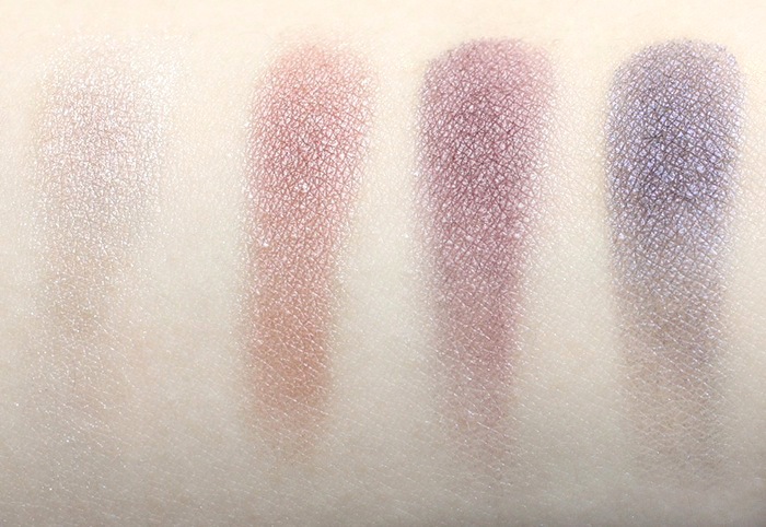
Aside from that, all the shadows are nice… but none of the other three stun my socks off the way that the violet does! I also quite liked the lighter violet (just enough plum and red to create a great cranberry-violet,) and hilight shade wasn’t too chunky or fallout-y. However, the burnt orange shade really isn’t my thing, probably definitely because I hate orange. What it does do, though, is make the palette more wearable for both cool- and warm-toned ladies!

The verdict? It’s a keeper! These quads aren’t perm, so make sure to pick up Royalty before the end of winter. I promise, it’s worth it! Check out the FOTD here.
Teal Chic

Okay: I did not like this for the reasons I thought I would. I was super, super excited about that gorgeous teal shade — but it turned out to be a total flop. It goes on patchy and barely exists if you use it dry, and then it has the nerve to stain your skin! It was so icky-looking (like children’s watercolours!) when I tried to use it in a FOTD that I had to layer on another blue-green instead.
And then there’s that forest green, what I thought would be my second-favourite shade. Well, it’s more of a greenish black, as I’m sure you can see from the swatches. Disappointment! But at least it blends well, and it can really smoke up a look. (Though, it can also really dirty up a look…)
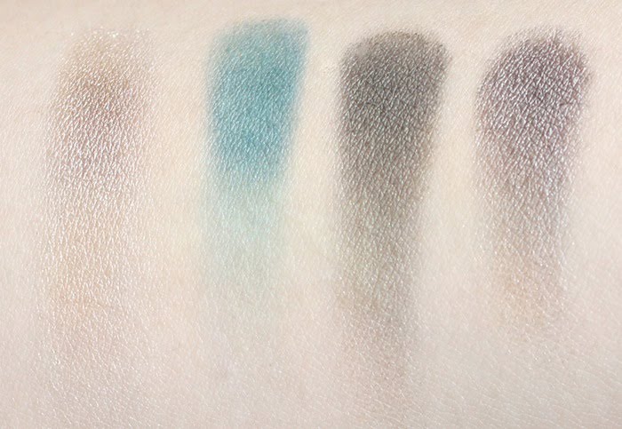
The verdict? I’d pass on this one — the “main attractions” really let me down, and I find the shadows to be a little harder than I’d like. However, the two “boring” shades really have me wowed, so if you must get this anyways, it wouldn’t be a half-bad decision ;) Check out the FOTD here, but keep in mind that the blue in the photos was actually Blue Hue (because this one was such a flop!)